Writings and lettering
Historical writings and lettering, typefaces and, above all, writing and handwriting often present a very special challenge for modern film production. This applies in particular to old and especially old German scripts. A precise knowledge of the various writing and printing fonts in their respective eras and regions is just as indispensable as a sound knowledge of the writing materials and writing media.
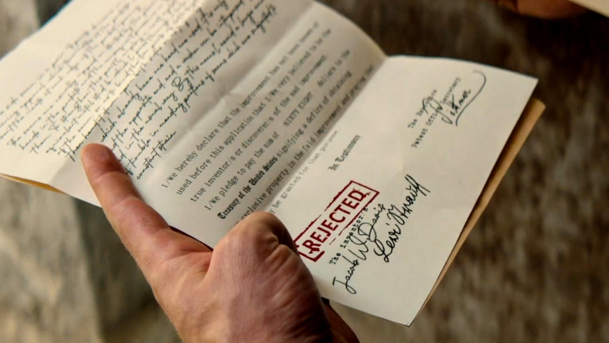
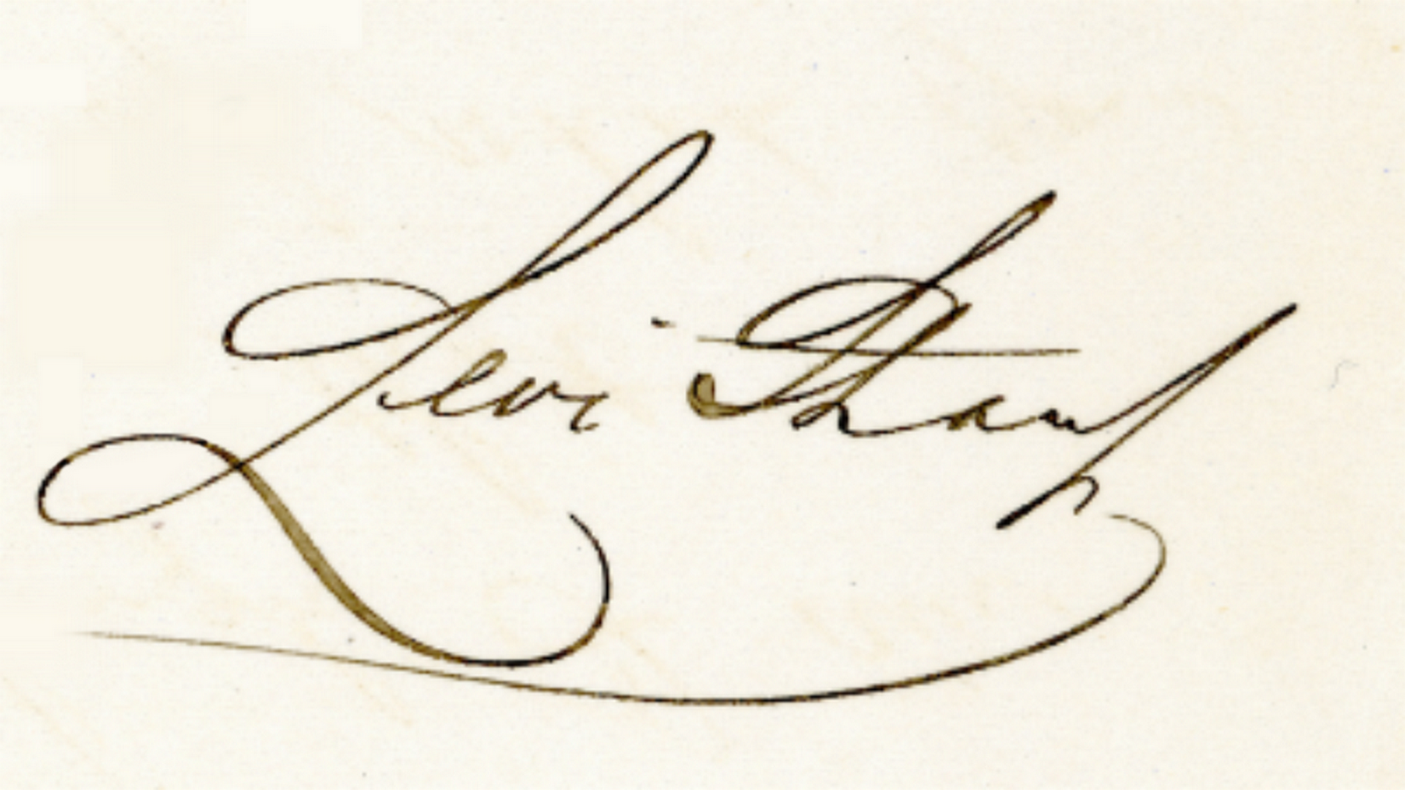
In one scene of the German four-parter „Levi Strauss und der Stoff der Träume“ („Levi Strauss and the stuff of dreams“) (2025) by Neele Leana Vollmar, the title character opens a letter from Washington, the rejection of his patent application for jeans with rivets. This patent application is a facsimile of the highest quality in form and content. The paper is firm and thick, a little yellower than today’s writing paper, but it is not yellowed, but as good as new. As the typewriter was only introduced in the 1880s, the writing is correctly handwritten. The handwriting also corresponds to the fonts used in America at that time, and it is clean and accurate. At the bottom is a form of the application form, and the form bears a red rejection stamp and three signatures. The paper is smooth and not wrinkled, and all of this probably looks pretty much exactly like the form that Levi Strauss actually held in his hands in the early 1870s.


Only Levis Strauss‘ signature looked a little different, namely as it is shown here. The signature on the patent application shown in the film at the bottom left, on the other hand, is a mixture of Latin letters and a – not entirely correct – Sütterlin script, which is also a German script based on Kurrent, but which was only introduced in the early 20th century.
The correct execution of historical manuscripts
In some scenes of the same film, there is a handwritten sign with the inscription „Closed“ in German Kurrent, a script that was in use in Germany throughout the 19th century and which Levi Strauss could have used even after his move to the United States.


Hardly anyone today is still familiar with old German scripts. Otherwise they would certainly have noticed that the s in the middle of the word is missing the descender. In addition, the small e is much more like a small n. Marking the letters without knowing them can lead to mistakes that can be avoided with expert advice.
The right language in the right place
„Krieg der Träume 1918-139“ („War of Dreams 1918-1939“) (2018) contains the following scene: Marina Yurlova knocks on the toilet door on the train from Omsk to Vladivostok in September 1918. On the door is a sign with the German inscription „W.C.“ (rest room). Correctly, the sign should instead read in Russian and in Cyrillic script: „Туалет“.

